Tag Archives: distress oxide inks

Free Cut File | TIME TO SHINE

Scrapbook Nerd and the Cut Shoppe

Hi there!

We hope you had a fabulous Canada Day! ( July 1st is Canada Day, and since we are a proudly Canadian store, we hope you got to celebrate our country), and to celebrate (and because it is the beginning of the month)  we are releasing a new cut file,  Time To Shine. Our friends at The Cut Shoppe have designed this fun and summer filled cut file for us, and now it is available to download for free in the store.

Isn’t the cut file so much fun and filled with possibilities.   Well, then let’s see how some of our Creative Team has used the cut file in their projects.  First up is Nathalie.

Hi there!

Oh, the glorious days of summer are well spent at the pool!  well, at least my littles love to come over and spent their days at our pool, so the new Time to Shine cut file is perfect to document these precious memories.

I chose to use the large title in the cut file to express the sentiment of the page.  I made sure to enlarge the title so that it covers a large portion of this page, thus become the focal point of this page.

A few Distress Oxides and a stencil, the watery background was created on Marshmallow Cardstock from Bazzil.  While this dried, the title was backed with papers from the Poolside collection from Fancy Pants Designs.

To add dimension on the page, the title was attached with some foam adhesive, then it was all about embellishing the page!    The Poolside collection is filled with lots of die cuts and ephemera pieces that are perfect to document those pool memories, so it was a breeze to create clusters on the page.

This page was so much fun to create, but now I will pass it onto Joy so she can show you how she was inspired to use the cut file in one of her projects.

This card was fun & easy to create. Joy loves using Distress Oxide Inks to make blended backgrounds for cards. Inks used; Peacock Feathers, Fossilized Amber, and Worn Lipstick.

Summer ink blending card by Joy

Joy then simply cut the Flamingo and the Sun tab from the Time To Shine cut file with black cardstock for some high contrast with her ink choices. The bold black on those colours looks awesome.  Joy typed out the sentiment on some white cardstock using her vintage typewriter and then glued all the pieces to the background.

This card is so fun and just screams summer. 🙂

Now Nathalie is back with you with a bit more inspiration using the Time to Shine cut file.  This time, I chose to show you how the designs can be used in a different format such as a Traveler’s Notebook.


For this spread, the ice cream cone of the design was cut so that it fits within the limits of a page of the TN.   The shape was then backed with papers from Doodlebug designs Cream & Sugar and So Punny collections.


To make the details of the cut-out pop, a piece of paper from Fancy Pants Joy Parade collection.  I chose to add the title of the page right onto the cut out using a combination of stickers and die cuts from both Doodlebug collections, and Pinkfresh Studio’s The Mix 2


In order to balance the spread, I chose to layer pieces from the Chit Chat ephemera pack from the So PUnny collection from Doodlebug, and use some of the papers to back the picture.   To ground the picture, I added a strip of the Fancy Pants design and a few more details from Paige Evans Stickers tablet.


I love how this turned out, and now it is your turn to put the cut file to work in a project of your choice.  Remember to tag @scrapbooknerdca whenever you are sharing projects created with the digital cut files on social media,  We would love to see what you do with the cut files.

Until next time,

Nathalie

Nathalie @ scrapbooknerd.com

Weekly Creative Team Digest

Welcome back to another revealing post with projects from Gisele, Mari, and Nathalie.
This week we have a super cute birthday card, a fun ‘dance’ layout, and beautiful layout with a watercolour background.

First up is Mari’s super cute Birthday Chicks card.
There’s nothing like some little Birthday Chicks to celebrate spring! Mari created this card using the MFT Birthday Chicks stamps and dies sets. The images were colored using colored pencils. The background was created using a piece of Ranger watercolor paper and
Kuretake – Gansai Tambi – Gem Colours watercolor paints. These paints add a gorgeous sparkle to the background. Glossy Accents, Wink of Stella and glitter glue were used on the images to add even more sparkle to the card. A few sequins were added as a final accent.

Next up is Gisele.
Gisele used the Simple Stories Dance collection for this fun layout. One of the 3×4 cards from the cut-a-part paper serves as the title, a great way to use those cut-a-part papers. Gisele added some Studio Calico wood veneer stars, she always puts something inspired by nature on her grandnieces’ pages and Vicki Boutin’s cute little bird clip was just right.


Last but not least, this layout Nathalie created features Crate Paper’s Good Vibes collection.
She layered papers and ephemera pieces behind the picture and then added a pom-pom frame to bring to focus the picture of her nephew walking along the river trail. The background of this page was created using Distress Oxide Inks and the packaging technique. Finally, the title was created using the Good Vibes stamp set and one of Dear Lizzy’s large paintable chipboard words .

We hope you found some inspiration in today’s post and if you have any questions we are just a comment away. Have a crafty weekend!

ScrapbookNerd.com

Free Cut File | 12×12 Layout – H2O PLAY –

Hi there!

Nathalie with you today -it has been a while since my last post!-, bringing you some inspiration using the “All Angles” cut file.   This new cut file was designed by Ashley Horton from the Cut Shoppe exclusively for Scrapbook Nerd, and it is now available for free at the store.


This cut file is great to document all types of memories.  Since we have had a super packed summer season, there are plenty of pictures to document, so I chose to put a Summer/water spin to the cut file.


First, I used Distress Oxides to create a watercolor background effect on white cardstock.   While that dried, i created the cut out for the page, by adding an offset to the image, and then just cutting about half of it only.


I backed every other one of the triangles with papers from Bella Blvd.’s Secrets of the Sea collections, but opted to also glue some of the negative triangle cut outs as open flaps here and there -a bit of foam adhesive was used to create dimension on the page-.


Once the background was completely dried,  it was trimmed by about 1/4 of an inch on each side, and then it was completely glued  to one of the papers from the Secrets of the Sea girls collectlion.  The cut out was then attached  on an angle on the page.


To bring the colors of the water to life, the palette on the clusters and titles for this page were kept to blue, yellow and s few green spots.    Since I wanted the picture and background to stand out, I kept the clusters small, and just to the negative spaces on the page.  Here is the final layout:


The combination of the mixed media, and the angular cut out are just perfect to document this summer/pool memory.  Now that you have seen the cut file in action, it is time to stop by the store to pick up your free copy of the file.   I cannot wait to see what you create with it.  Remember to tag @Scrapbooknerdca on any of the social media outlets whenever you share your creations!

As always, I am a comment away if you have any questions on how this came together.


Take care!

Nathalie @ scrapbooknerd.com


Material used:

AC white cardstock; Bella Blvd. Secrets of the Sea collection (boy and girl); Bella Blvd. Secrets of the Sea collection puffy stickers (girls): Secrets of the Sea collection (boys) die cuts; Bella Blvd. Secrets of the Sea (girls) 6×8 paper pad; Bella Blvd. Acrylic word -Play-; Distress Oxides in Faded Jeans, Salty Ocean, Broken China; Pinfresh Studio IN the Mix 1 collection – layered chipboard stickers.

Sunday card share #85 – You’re awesome

Sunday card share at scrapbooknerd.com

Hey there everyone,
I’m happy to be back sharing another card with you today and as you can probably tell, I’ve been working with Distress Oxide Inks again. I just really like making my own coloured backgrounds.

The colour combination I used for this card is Broken China, Iced Spruce, and Faded Jeans and I thought they would be great for a masculine card.
I used a blending tool to apply the inks to the watercolour paper until I was happy with the look, I then misted the card front with water and dried it with my heat tool. I applied another layer of ink blending and then flicked water onto the panel to get some bigger water marks, I then left it dry. 

I wanted there to be some silver on this card somewhere so I ended up adding some Clear Wink of Stella to the black die-cut star. I punched two circles from some scraps of pattern paper to layer underneath the robot…it really needed another punch of colour.

I used my vintage typewriter for my sentiment, which I found on a search on Google, it’s a favourite go to of mine when I don’t have the right sentiment stamp. I finished off the card with some enamel shapes and a black cardstock A2 size card base.
I refer to this style of card as ‘scrappy cards’ because I use scrapbooking supplies to make them and there is usually no stamping required. I get a bit inky while making the background and I use up embellishments and paper scraps that have been sitting in my stash for a while.

See you next Sunday!

Joy @ scrapbooknerd.com

Products Used:
Broken China Distress Oxide Ink
Iced Spruce Distress Oxide Ink
Faded Jeans Distress Oxide Ink
Crate Paper – Cool Kid Rubber shapes

Black Cardstock
Distress Watercolour Paper
Clear Wink of Stella pen

Paper scraps from the Crate Paper Boys Rule collection
Vintage Typewriter
Enamel Shapes

ScrapbookNerd.com

Art Journal page using Distress Oxide Inks and TWC stencils

Art Journal page using Distress Oxide Inks

mixed media Monday at scrapbooknerd.com

Hey there friends,
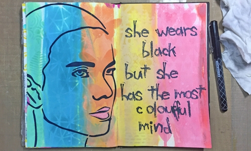
I have really been enjoying Distress Oxide Inks and I decided to work with them in my art journal. I used the inks directly on the pages of my art journal, pulling them down the page from top to bottom.
Art Journal page using Distress Oxide Inks and TWC stencils

After adding the oxide ink, I held my journal on end and sprayed both pages with water. Enough water to get it dripping down the page. Adding the water to oxide ink is important to get that oxide reaction working.

After the pages were dry, I added stenciling to each of the colour blocks with the same colour of ink. Oxide inks are great for layering, each layer added sits on top of the last layer.
Remember to dry between layers.Art Journal page using Distress Oxide Inks and TWC stencils
The face stencil is from The Crafter’s Workshop and I used Dina Wakley Night paint to stencil the face on the left-hand page. I found the black quote on Pinterest and stamped in on my journal page with a Dina Wakley Alpha stamp set and black archival ink.Art Journal page using Distress Oxide Inks and TWC stencils

I missed stamping the letter ‘r’ on my page so I had to go back and write it in.
It’s far from perfect but I’m okay with that.

I hope you found some inspiration in today’s post.
I would love you hear if you’re loving Distress Oxide Inks and how you enjoy using them.

Happy crafting!!

Joy @ scrapbooknerd.com

ScrapbookNerd.com


Sunday Card share - Distress Oxide Ink watercolour cards

Sunday card share #83

Sunday card share at scrapbooknerd.com

Hey there crafty friends,
Welcome back to the SN blog, after a bit of a break Sunday card share is back.
For today’s card, I chose to go with an easy technique for getting a watercolour look using Distress Oxide Inks and a pack of Amy Tangerine – Oh Happy Life – Watercolour Resist Cards I’ve had sitting in my stash for a bit so it was time to get them used.

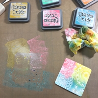
I believe the technique I used Tim Holtz calls wrinkle-free Distress, I just call it an easy watercolour background. 😀 I simply pressed different colours of Distress Oxide Ink onto my craft mat, sprayed it with water, then pressed the watercolour resist cards into the pools of colour.

Sunday Card share - Distress Oxide Ink watercolour cardsSunday Card share - Love you Distress Oxide Ink watercolour cardI added a little bit of stencil work to the kraft card base with Vintage Photo ink, then added a few layering papers. One piece of old book paper and the other I stamped a music note background stamp onto a 2 inch piece kraft paper and cut a banner tail on the bottom. 
Sunday card share - Distress Oxide Ink watercolour

I cut a small piece from a doily to add some interest to the lower left of the watercolour piece and the adhered the whole circle to the front of the card with foam tape for a little dimension.Sunday card share - Distress Oxide Ink watercolour

While I was getting inkie, I used several different watercolour resist cards and just had fun using the same technique I mentioned above. These cards will show up in some future projects.

Sunday Card share - Distress Oxide Ink watercolour cards

Thanks for stopping by, I hope you got inspired.

Products used:
Distress Oxide Inks
Amy Tangerine – Oh Happy Life – Watercolour Resist Cards
Kraft cardstock
Crafty Foam Tape
Joy @ scrapbooknerd.com

ScrapbookNerd.com

Sunday card share #82

Sunday card share #82 – Father’s day card

Sunday card share at scrapbooknerd.com

Hey there crafty friends,
Welcome back to another card share, today it’s all about Distress Oxide Inks.
These inks are so easy to blend and I’ve tried the oxide inks on several different kinds of paper. In fact, the panel on this card was made with a cheap index card and it looks great.

Sunday card share #82 - distress oxide inks, father's day card
Because Distress Oxide Inks are a dye & pigment ink fusion we can blend without creating a muddy look and the inks sit on top of the previous layer which also helps when we stamp with Distress Oxide Inks. 

I blended Fired Brick, Fossilized Amber, and Faded Jeans onto a 5×7 index card and then dried it with my heat tool. I then added some stamped images over top of each colour with the same three colours I used in the blending. After the stamping was dry, I flicked some water over the entire panel and let it sit for a minute or so. I took a paper towel and picked up the excess water and then let the panel dry.

I die-cut the panel with the large stitch rectangle die from Lawn Fawn and then got working on the wood veneer sentiment. I added some black ink to an old Studio Calico wood veneer alphabet and I adhered it to the card front. I then adhered the ink blended panel to the black card base with double-sided foam tape for some dimension.

Sunday card share #82
With some leftover bits, I die-cut some small hearts for the inside of the card for some embellishment.Sunday card share #82 - distress oxide inks, father's day card

I hope you enjoyed the card share today and that you found some inspiration.
Happy Sunday!

Joy @ scrapbooknerd.com

https://static.inlinkz.com/ppr.js
ScrapbookNerd.com