Tag Archives: Nathalie DeSousa

Having Fun with Along The Way

Hi there!

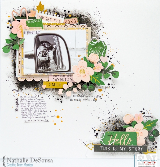
Nathalie with you today with a new layout that showcases the new “Along The Way” collection from Pebbles.   I  am a confirmed paper lover, but nothing makes me happier than finding collections that can be used in everyday documenting.   This collection has rich colors, and many designs that can be used at any season or time of the year.


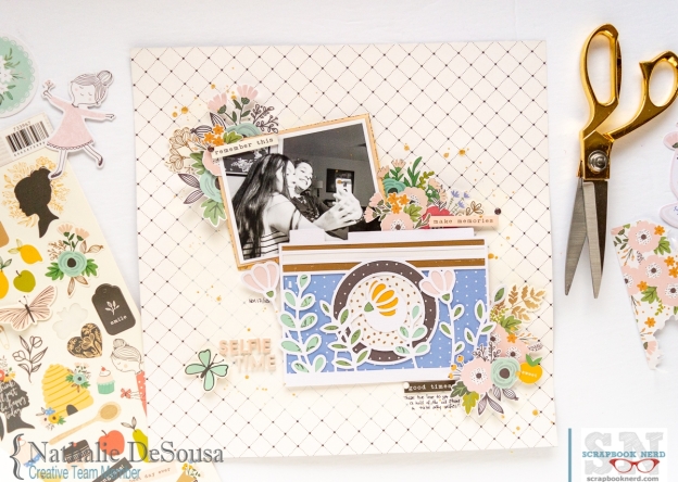
What better way to showcase a collection while documenting a picture than to detail backing a cut file.  For this layout, i chose a cut file from Handipaper, Floral Photo Camera to create one of the focus points of  this page.


This cut out is rather simple in design with intricate details, so i was careful backing each of the small areas of the cut to make sure that the small details come forward.  All the patterned paper in the collection made it so easy to bring the camera to live for this page.  The following video will show you a more in-depth look on how the page was put together:


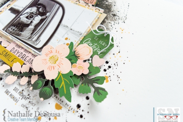
The placement of the picture in the page, along with the detailed camera are the focus of this page.   However all the fussy cut floral motif from the patterned paper, ephemera and stickers bring softness to this page.


To avoid taking the focus away from the picture and cut out, a simple title was created using alphas from the Whimsical collection from Pink Paislee, and accenting it with a sticker from the Along The Way collection.


I hope this has inspired you to stop by the Scrapbook Nerd store to check all the materials used in this page.   Remember there are always new goodies arriving at the store!

As always, if you have questions on how this came together, please just leave me a comment here.

XO


Pebbles – Along The Way collectionn -12×12 paper pad, 6×8 paper pad, ephemera, stickers, word stickers, enamel dots

Pink Paislee – Whimsical collection – foam alphas

Heidi Swapp –  Gold Lame colorshine

WRMK – Mini Guillotine


Creative Team Weekly Digest

Hi there!

It is getting closer and closer to the magical days of Christmas.  We are so excited to welcome the holidays and  document all the memories that come with this season.   Our Design Team has been busy creating projects that will inspire you.  First  up Mari.


Mari created these Christmas Tags using the Lawn Fawn Say What tag dies and the Lawn Fawn Holiday Critters stamp and dies. The patterned paper used as accents is from the Really Rainbow Christmas, also from Lawn Fawn. There are so many options with these stamps and dies; the middle tag has a shaker element using sequins and shaker mix from Studio Katia.


It’s fun to make your own tags at Christmas time to attach to a gift for someone you love! They will adore these fun tag elements!   Thank you so much Mari for these beautiful tags!

Next up is Nathalie and her colorful Holiday layout,


This week’s tutorial focuses on creating embellishments that will work with the ones in the Holiday collections,  Nathalie chose the new Merry Days collection from Crate Paper, and used mixed media and cut files to create the colorful background.


You can read more about her layout and see how it all came together in the previous post.   The colors of the trees are nicely accented with gold and embellishments from the collection.


Well, that is all for us today.   We would be taking a small break to enjoy our families and the season, so let us take this opportunity to wish you all peace, love and joy during the upcoming Christmas and thank you for all your support this year, we wish only the best for 2019.

Have a blessed holiday season!


Nathalie D - designer at scrapbooknerd.com


Tuesday Tutorial: Creating Embellishments for your layouts

Hi there!

It is December!  Cue the confetti!!!  it is the jolliest and happiest of times (for some of us that is!) so, what better way than to celebrate it with color.  Today, I want to show you a simple way to make the most out of your Holiday collections while customizing some embellishments for your layout.


When I think Christmas, I always think of festive times with lots of color.   Unfortunately, the Merry Days collection from Crate Paper has color, but it is not as vibrant or festive as i have in mind for this layout.   Then, my choice was to create my own embellishments that will bring that much needed color to the page.   The following video will show you how it all came together:


As you can appreciate from the video, the colorful Christmas trees are customized to bring vibrancy to the existing colors of the collection.  The color is saturated in the trees so that they can show the small drops of white paint that are trying to create  snow capped branches.


The colorful trees are the basis for this page, as they bring the color and focus of the page to the picture of my two kids on their last day of school before the Christmas break.


By adding accents of gold in the embellishments used in the page, I am able to marry the new created colors to the pre manufactured stickers and embellishments.


All the colorful embellishments and background of thie page are the perfect background for this happy memory of my kids a few years ago.


I really hope you are inspired to customized embellishments and backgrounds for your next layout,  Remember you can always contact me if you have questions on how this came together.  Also, you can find all the materials used in this layout in the Scrapbook Nerd shelves so, stop by to check them and all the new arrivals.

Have a blessed day!


Nathalie D - designer at scrapbooknerd.com


Merry Days collection: 12×12 papers, 6×8 Paper pad, chipboard stickers, puffy stickers, cardstock stickers, word stickers

Jane Davenport Mermaid Markers

Heidi Swapp Color shine in Gold Lame

Vicki Boutin Foundation paper


Creative Team Weekly Digest

Hello everyone!

Hope you all are enjoing what is left of Fall, it is snowing here in Canada already!   We took this week to celebrate Gratitude, and have asked our DT to create projects that document what they are thankful for.   So, let’s see what they have created this week, first up is Mari.


Mari created her layout using the Vicki Boutin mixed media products and papers and embellishments from Field Notes. Using a Crafter’s Workshop stencil, Mari added some acrylic gel medium to the edges of the Bazzil Marshmallow card stock. Once dry, she added some Art Crayons with a stencil brush.


Mari also added some Foil gel and added some Gina K foil to a few areas. Some more Art Crayon was added in a few other areas of the background using the Vicki Boutin stencil and the stencil brush. For more details, head over to Mari’s YouTube channel for the full process.  What a fun and colorful layout,  Thank You, Mari.

Next up is Nathalie.

Nathalie was up on this week’s Tuesday Tutorial with this new page that focus on working non-seasonal paper collections into a Gratitude page with an Autumnal feel.


She combined Kaisercraft’s Full Bloom collection and Vicki Boutin Mixed Media to create a soft layout that celebrates her family bonds.  You can check more details of the page on the previous post.

Now it is Joy’s turn.


Joy created this TN page in a Prime Marketing watercolor insert using watercolor crayons, a few stencils, stamping inks, and a favorite  quote about gratitude.   Art journals and now TN pages are Joy’s favourite way to collect life reminders and quotes.   Beautiful spread, Joy!

Wow!  what an amazing group of projects that celebrate gratitude.  We hope these inspire you to create a project about something you are thankful for!    Remember to stop by the Scrapbook Nerd store to check all the new products that are arriving at the store!

xo

Nathalie D - designer at scrapbooknerd.com

Using Gold tones to create a seasonal layout.


Hi there!

It is starting to look a lot like Fall is about to transition into the most wonderful time of the year!  But before we move onto the next season, our friends and family in the US are prepping to celebrate Thanksgiving, so we have decided to dedicate our week to document our gratitude.


Today, I want to show you a new layout that creates a seasonal layout using a non-autumn paper collection.   We all are guilty of categorizing our paper collection based on the designs, colors and themes.  However, there are a few little tricks we can use to repurpose them so that they fit the season you want to document.  In this case, I am using a Spring collection to document a Fall theme; so, i decided to pull lots of gold and gold tones to bring some of the coziness of the season to the page.  The following video will show you how it all came together:


As you can see in the video, I used a bit of mixed media and a fall colored patterned paper to bring those warm tones to this page.


Eventhough the papers used to back the flower cut outs are not seaonal, the use of the mustard patterned paper to back the leaves bring the perfect autumnal accent to the background.   The soft matte gold watercolor around the picture makes all the details in the flowers pop, but also bring a bit of the fall-tones to the background.


Bringing some more rustic tones (like the ones in the woodgrain paper) to the layout will also help to bring the shine and shimmer in the gold materials added (as splatters and watercolor) to the background.


It is amazing how a little color in the background, and in small accents around the page can easily transform an every day layout into a seasonal themed page.   Remember to  check all the materials used in this project at Scrapbook Nerd, and please do not hesitate to contact me if you have questions about this page.


XO


Nathalie D - designer at scrapbooknerd.com


scxrapbooknerd.com supply list


Kaisercraft –  Full Bloom collectio and collectibles

Vicki Boutin Art Crayons (warm and neutral sets), gesso,  foundations paper

Heidi Swapp gold lame color shine

Concord and 9th – Thankful Leaves Stamp set

Jen Hadfield’s Sticker book


Creative Team Weekly Digest


Hi there!

The weather is cooling, the leaves are falling, PSL is back and we all are looking for our cozy sweaters… It is Fall, y’all!!   What a great time to enjoy nature, and all its splendor; this was the inspiration for this week’s projects from our design team,  “Fall Colors”.  So, let’s see what they created, first up is Mari.


For fall colors week, Mari created an 8 1/2 x 11 Scrapbook layout using the Vicki Boutin Field Notes collection. Using the Art Crayons and Vicki Boutin stencils, Mari added some color to the white card stock. Some Irridescent Glaze was added through a stencil to create some texture on the layout.

Other stickers and die cuts from Field Notes have been added, as well as a strip of patterned paper to the top 1/4 of the layout. The black title piece has been added using the gorgeous phrase sticker sheets in black.

What a beautiful color combination and all the mixed media on the background.   Gorgeous layout, Mari.  Now let’s see Milena’s project.


101418 page

Milena was up on the blog this week with her take on this week’ s sketch.   She also chose to work with VIcki Boutin’s Field Notes collection and multiple Pictures.


Sunday Sketch 101418

You can find all the details of her page on the Sunday blog post.  What a great sketch, and Oh, the possibilities!  Thanks, Milena; and now let’s see what Nathalie created.


Nathalie was up on the blog’s Tuesday Tutorial spot.  She chose to showcase how to create a color family for a multicolor background using Vicki Boutin’s Acrylic Pop Paints.  You can find all the details and process video in the previous blog post.


The color combo, all the stamped images, and the vellum leaves are the perfect canvas for the sweet picture of her niece.  Great layout, Nathalie.

Well, now it is time to use some of this inspiration on your projects.  Remember to check Scrapbook Nerd store for all the materials used in these projects.  There are so many new products arriving at the store, so make sure to stop by to check them all!

Thank you so much for visiting!

Nathalie D - designer at scrapbooknerd.com

Creating with a Fall Color Palette | Nathalie DeSousa

Hi there!

Nathalie with you today to bring you a new project inspired by the colors of Fall.  This week we will be creating projects inspired by color, and i wanted to show you how to build a color family background using acrylic paints.


The colors used here are the ones in a Fall sunset (i found the colors by doing a Pinterest search, “Fall color palette”), and were replicated using Acrylic pop paints    The key to having a cohesive look to the background -not harsh transitions between the color stripes- is to build the colors using a same color base.  This means you start with the lightest color, in this case yellow, and create the colors using this as a base.  The background color will be the one that softnes the transitions and help create a cohesive color family.   The following video will show you how this page was put together:


How simple and colorful is that background?!  The color stripes are the perfect base to bring the rest of the layout to live.   The simple stenciled details are just subtle enough to add interest to the stripes


The leaf cut outs and stamped flowers are a great way to create clusters in this page without losing a large part of the background.


The smalls pop of gold complement all those ephemera pieces and stickers from Vicki Boutin Field Notes and All The Good Things collection.


The title brings the warm tones of Fall into this page, and complete the golden look of a modern Fall layout.


Remember to stop by Scrapbook Nerd to check all the materials used in this page, and all the new goodies that are always arriving at the store.   As always please do not hesitate to contact me if you have questions on how this came together.

XO,

Nathalie D - designer at scrapbooknerd.com


Marshmallow Cardstock, vellum  – Bazzill

Gesso; Acrylic pop paint in White, Crushed Pineapple, Sugar Strawberry, Coral Macaroon, Plum Pudding, Orange Slice, Cherry Tart, Cotton Candy and Black; Art Crayons – warm , neutral sets;  Stencil Brushes  – Vicki Boutin

Shine – Stamp and Die Set – Vicki Boutin

Stamp and Die set #2 – VIcki Boutin v

Field Notes collection – Collect and Document paper, Chipboard stickers, Watercolor Stickers, Ephemera Pieces – VIcki Boutin – American Crafts

All The Good Things collection – Cardstock Stickers – Vicki Boutin – American Crafts

Gold Puffy Thickers – Sweet & SImple collection – Pinkfresh Studio

Gold Puffy Thickers – Flourish collection – Maggie Holmes- Crate Paper


Creative Team Weekly Digest

Hi there!

It is time for the weekend!!! The perfect time to relax, rest and hopefully get creative.  This week our DT has been sharing some beautiful projects that are sure going to inspire you this weekend.

First up is Gisele with a gorgeous layout that showcases Simple Stories I AM collection.

GIsele used papers from the Simple Stories”Cabin Fever” and Crate Paper’s “Flourish ” to create the background for this page.  She created the butterfly embellishments by combining fussy cut butterflies from the I am collection, and some punched vellum.

Gisele added some layers of papers from the collection behind the picture and then added a few fussy cut flowers to the corners of her layers.

Gisele combined  alphas from different American Crafts collection to create her title, and then used stickers from the I AM collection to complete her journaling.  Such a beautiful page, Gisele!


Next up is Mari with a series of mini book ideas.

Mari created her first mini-book page using a piece of Bazzil Marshmallow card stock. The paper was trimmed to 6×6. Then, using the packaging technique, Mari added color to the white paper with Distress Oxide Inks in colors that complement the Amy Tangerine “Shine On” embellishments and paper.

For this 3×3 folded mini-book, Mari used Pink Paislee “Turn the Page”. The book is created using a 12×12 piece of patterned paper, folded into 3×3 squares in an accordian fold.

This 6×6 album was created by covering chipboard with patterned paper from Crate Paper “Willow Lane” and then embellished with a variety of Maggie Holmes collections.

These minis are so gorgeous, Mari!  Thank you for sharing!


Last is Nathalie with this week’s Tuesday Tutorial that focus on using black paint as the background for your pages.

She combined a bit of black paint with Kaisercraft’s Fleur collection to create this page.   You can find all the details, and watch her process video in the previous post.

Truly an eye catching layout!

Our DT has truly been sharing beautiful projects this week.  We hope these inspire you to get creative and  used them as inpiration to start a new project of your own!  Have a great weekend!

Nathalie D - designer at scrapbooknerd.com


Black Paint Backgrounds | Nathalie DeSousa

Hello Scrapbook Nerd friends!

Hope you all are doing well, now that Autumn is almost here!  YAY!!!

For today’s tutorial, i want to focus on using a “Black Paint Background” for your next project.  I know that the idea of adding mixed media is a tough one for many of you, so hearing of adding black acrylic paint to your page is probably making you scared.   But i am hoping by the end of this post you will take a try at this technique.

Can you see all the black paint in the back?  Well, though you can see peeks of the mixed media, all the layers of paper and embellishments also pop from the page.  It has to do with the contrast between the background and the many layers that are forming this page.  The following video will show you how this page came together:


Now that you have seen how this page turns out, let me give you a few tips on how to be successful on using and creating this type of backgrounds:

  • Use black acrylic paint (heavy body work a bit better, as they have less water which will prevent paper bucking)
  • A wide acrylic paint brush or a hard bristle brush work best when adding Acrylic paint and creating the feathering effect of the background.
  • If possible use a heavier weight of cardstock.  This will help with avoiding the paper curling.
  • A little bit of paint goes a long way.
  • Always start with a smaller area of mixed media.  It is easier to add more paint than to cover or take it away.  A good rule of thumb is to create a background that is only about half an inch bigger than the picture you will be using.


The dark background makes all the elements pop, think of it as the blackboard we saw in our classrooms.   These were designed to prevent light reflection and  make all the color chalks pop. In this case the black paint on the page works in a similar way, and brings forward all the details in the layers and embellishments.


Don’t you just love all the details and florals in the Kaisercraft “Fleur” collection!?!  The muted palette shines on this background, and just bring the picture forward.


Even when mixed media is not something you enjoy, this technique can easily be used to create a page with a dark background, or try your hand on getting messy.  I cannot wait to see what you create.  As always, remember to stop by Scrapbook Nerd to check all the materials used in this page and pleae do not hesitate to contact me, if you have questions on how this came together.

See you all soon,

XO

Nathalie D - designer at scrapbooknerd.com


scxrapbooknerd.com supply list

Kaisercraft – Fleur collection:  kit, 6.5×6.5 paper pad, collectibles

Marshmallow Cardstock

Dina Wakley Heavy Body Black Acrylic paint

Maggie Holmes – Willow Lane Collection – clear stickers


Creative Team Weekly Digest

Hi there!

Summer is rapidly coming to an end, and with it also go those long lazy hot days we all treasure so much.   While many of you take time off work to visit your cottages or travel, our design team has been busy bringing you some inspiration.

This week, we have asked the DT to create projects using Pink Paislee’s Auburn Lane collection, and  the projects are just beautiful, so let’s get started.  First up is Mari:

Mari cari created this layout using the color palette and collection pieces from Pink Paislee “Auburn Lane”. This collection has such a romantic/vintage feel…perfect for this wedding photo!


The Distress Oxide Inks used on the white background complement the colors from the collection. The JustNick Leaf Background cut file has texture paste added to it for some extra dimension on the layout. The florals and hearts are the perfect embellishments for this soft, pretty layout.

Love the soft tones and details in this romantic layout!  Beautiful page, Mari!  now it is Gisele’s turn to inspire us:

Gisele create this page with a picture of herself with her mother. Pictures those days were rare, and this is one of the very few she has of both of them. Circa 1953.

Her title is made of AC Thickers “Happy Life” and goes great with the gold in the page. She added a doily as a feminine touch and added sprinkles of Heidi Swapp Colour Shine in gold. In the upper left of the photo, she cut the ephemera frame in half and added both as corner embellishments. A few tags were added with a punch from her stash as well as the gold floss and the added heart charm

The play of patterns and that sweet picture make this a stunning layout!  Now let’s be inspired by Nathalie:


She created this page using fussy cut elements from papers from the collection.   This page was the focus of this week’s tutorial (previous post) that focused on adding fussy cut embellishments to your projects.


All those florals bring the page together by framing the picture of her family.   Beautiful page, Nathalie!


Well that is all for us this week!  i hope the DT projects have inspired you to take a closer look at Pink Paislee’s Auburn Lane collection.  This collection is available at Scrapbook Nerd, along with many of the newer liner releases.  So stop by to check what is new at the Store.

Have a great weekend!!


Nathalie D - designer at scrapbooknerd.com