Tag Archives: Heidi Swapp Color Shine

Focus on Long Titles

Paige @ scrapbooknerd.com

Hello Nerds!

I don’t know about you, but sometimes I get stumped by trying to come up with a title for my layout. And yet, for me, it is important to have a title on each of my layouts because I find that when I share them with people, most look only at the photos and the title. If they are not taking the time to read my journaling, then a title becomes even more important.

Then there are the times that a title almost becomes the focal point, or the inspiration for my layout.

For the past six months, I have been a devoted fan of the new TV show, This is Us. I watch each week, laughing and crying in equal proportion and falling more and more in love with the characters and their stories. One recent show touched millions of viewers and the next day, I followed the advice of one of the characters to “Roll all of your windows down. Crank up the music!” After a particularly difficult few months, this really did lift my spirits.

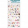
So I wanted to capture the moment and the feeling by making the title long, colourful and vibrant. I like to use all different fonts, sizes and forms of alpha stickers.
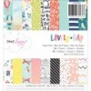
Long Titles

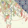
In this next layout, the inspiration was the story: how my son has created and used more than a dozen nicknames for our new puppy Wrigley. These two just adore one another, and the silliness of the names demonstrates Liam’s creativity and the playfulness they share.

I knew I would list all the crazy names and loved using the heart cut file to contain them. Then it took a while to come up with the title. At first, I was thinking “The many names of love”, but realized that was a phrase many faces of love. It took a bit, but finally the phrase “Love by any other name” came up – I think that it is from a book.

Again, I framed the photo with the title, and used the different colours of Thickers that occur in the papers backing the hearts.

Do you enjoy coming up with titles? I’d love to see some of your projects where you incorporate long titles.

Happy Scrapping!

https://static.inlinkz.com/ppr.js

ScrapbookNerd.com Canadian online paper craft supply store

Crazy Love – Dimensional Title tutorial

Hello Nerds!

I hope you all are enjoying the beautiful weather, and getting lots of crafting done.

This month, I was inspired to create using lots of white space, and focusing on the picture.  Since I wanted the titles to stand out on my white layouts (since most of them were made on white cardstock),  i used dimension and a hint of color to make them pop on the layout.   Here is how i went about creating my titles.

  • I used a cut file (Ashley Horton’s design) to create my title.  I cut 4 titles (with the same dimensions) on white cardstock using my Silhouette Cameo.   Note:   you can create this look using regular letters or alphas, as long as they are not thick -since they will be layered-.


CRAZY LOVE -title tutorial-

this is the original cut-out

  • Using the new Heidi Swapp MInc reactive mist, i covered one of  the cut-outs and set it aside to fully dry.  This step applies also to thickers or cut-out alphas.
  • While the mist dried, I attached two of the cut-outs together,  making sure that they sat flush together.  I tried to keep them as clean as possible as this piece will be the upper part of the title.  I set it aside to  ensure the glue dried completely.

CRAZY LOVE -title tutorial--2


  • I used the Heidi Swapp’s Foil on top of the reactive ink misted cut-out, and proceeded to put it through the laminator to completely set the foil onto the piece.  If you are using the MInc  machine, set the temperature to 3,  for any other laminator please check your manual for the right heat setting.  This step also applies if you are using alphas or thickers.


CRAZY LOVE -title tutorial--4

I chose this distressed look for the foil as it works with the layout; however if you want full coverage of the piece, i would suggest you use the Ink toner marker to color the piece before foiling


  • I glued the last cut-out to the newly foiled piece,  making sure that the  foiled side was facing up, and the two cut-outs sit flushed on top of each other.  I set it aside to make sure they dried completely.

CRAZY LOVE -title tutorial--5


  • The final step is to attach the white cut-out pieces to the foiled pieces making sure that there is an overlap on the pieces. In my case,  a small portion of the foiled cut-outs show under the white cut-outs -it looks like a shadow, or 3D piece-.  You can do the same if you are using alphas or thickers.   Make sure that you use strong glue, and leave it to dry completely before attaching it to your project.

CRAZY LOVE -title tutorial--6


  • If you don’t own a laminator,  the same look can be achieved by using the same cut-out but in different colours or textures.
  • I would suggest you used strong adhesive or a hot glue gun to attach the title to your project, as the layers do add weight -that could rip the layout’s mat-.  Here is how this title looks once attached to the layout.


Crazy love -tutorial- @scrapbooknerd.com

The small overlap of the white pieces on top of the foiled ones, give this title the look of graffiti on a wall, and helps to make it stand out on the layout.


I hope you try this idea on your titles or cut-out pieces on your projects.  It is not necessary to use foil pieces (I happen to love my MInc machine), just to create contrast and the overlap.  Here is  the final layout:


CRAZY LOVE @scrpbooknerd.com

The title stands out on the busy background.


As always let me know if you have any questions about this tutorial.

Till next time,

Happy Crafting!!!


Nathalie @ scrapbooknerd.com

ScrapbookNerd.com Canadian online paper craft supply store